The user problem
At the very start of the user journey, after 5 to 7 questions the user reaches a point of no return. A place where if they continue they cannot amend the previous confirmed information they have provided for their declaration of transit.
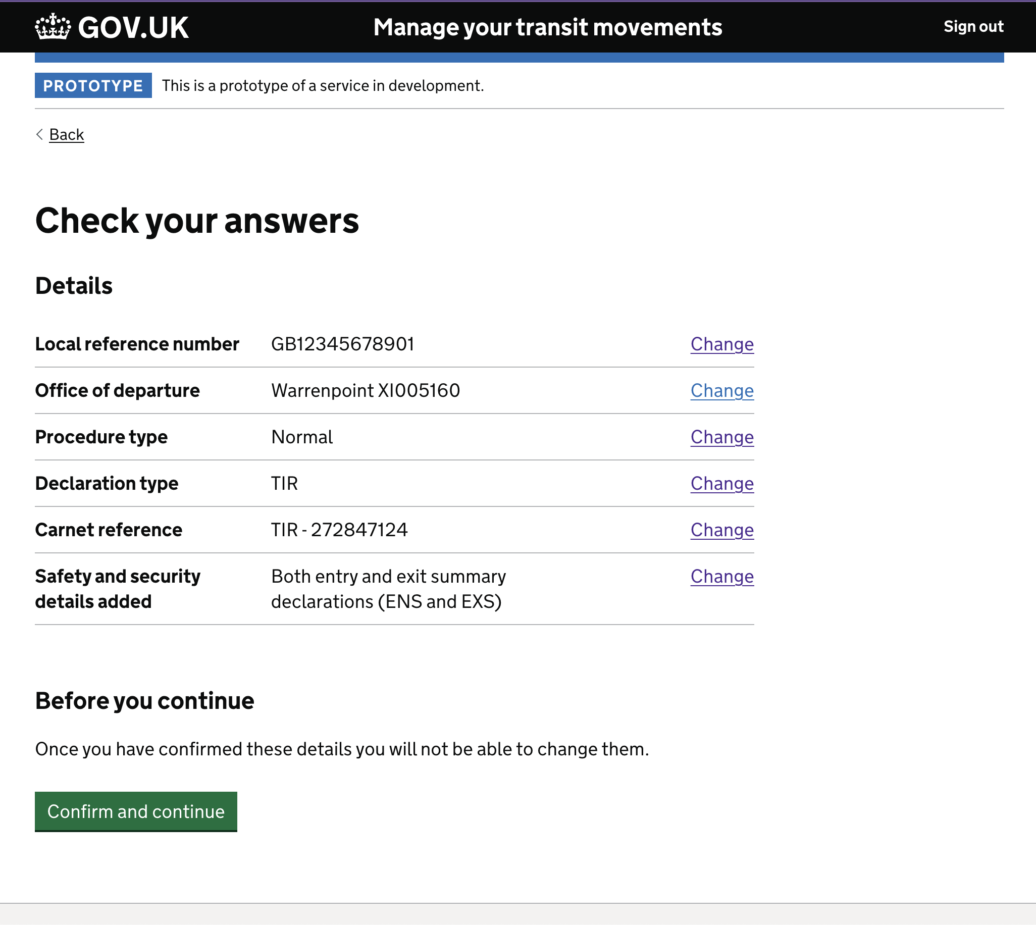
- The first round of user research found that 6 out of 6 users completely missed the context of the ‘Before you continue’ text.
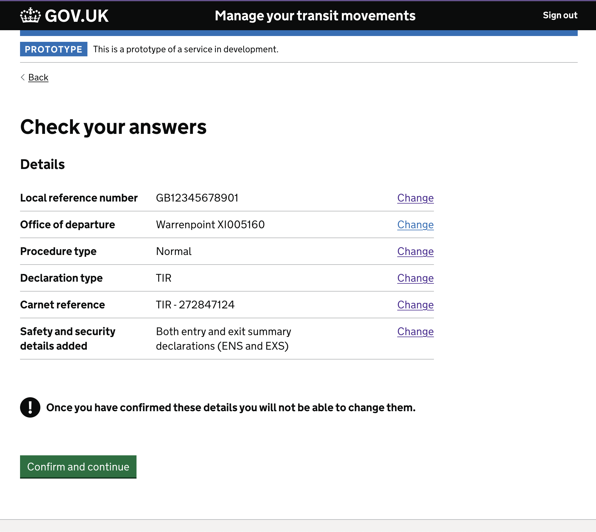
- The second round of users 5 out of 6 users missed the ‘Warning text’.
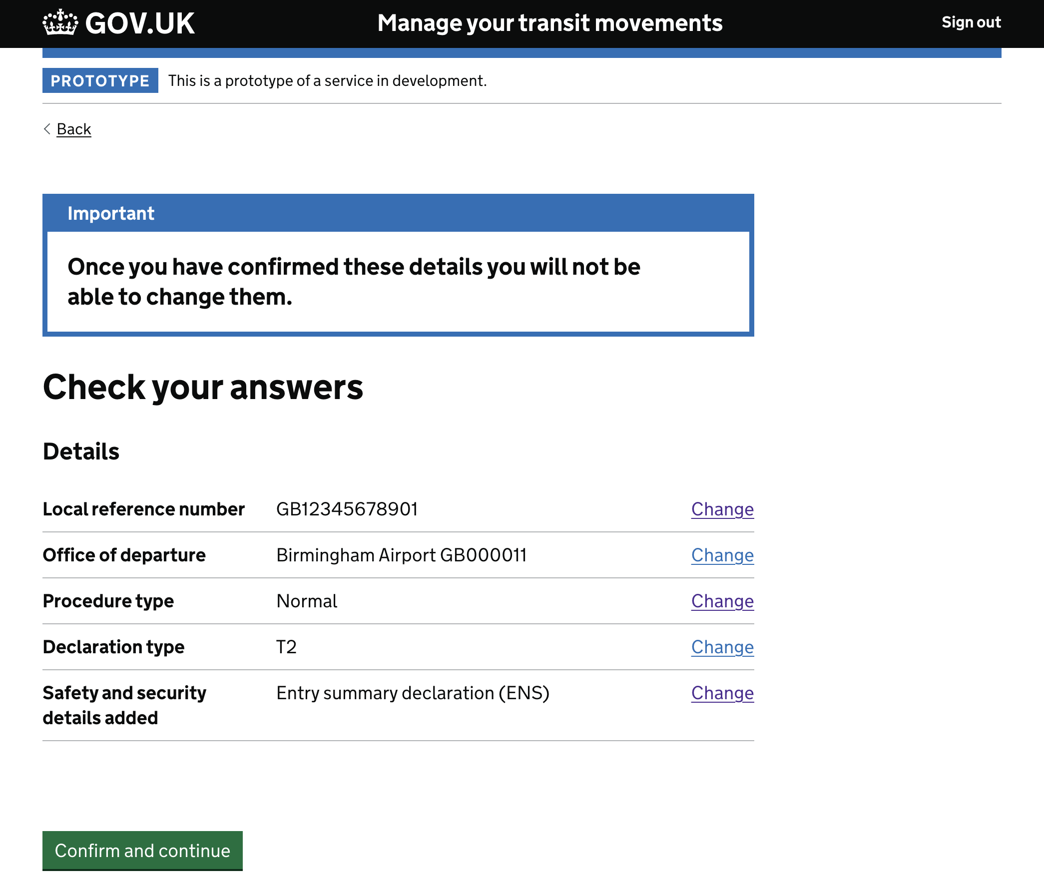
- Finally the ‘Important notification banner’ has successfully relayed the information to the users.
Focusing on a ‘macro’ interaction, allowed the team to provide the appropriate solution in order to achieve a 100% success task completion rate.
The solution
After the first failed attempt the interaction designers for that team brought their problem to a Design Crit, which we used to run every other Wednesday at the HMRC. Now, the frequency can change on demand; what’s important is to always create a space for everyone to collaborate.
Screenshots
- The first iteration, had a simple paragraph with an h2

- The second iteration had a ‘Warning text’ in bold and with the exclamation mark icon

- The final iteration has the experimental ‘Notification banner’ in the standard blue version

Conclusion
User testing is a key factor to design having the impact it needs to improve user experience, engagement whatever the goal. Iterations of the required changes bring you closer and closer to that said goal. Testing small and frequently enough allows small team to get to address user pain points accurately and fast. Moreover, enabling designers to bring key questions into a Design Crit, where open discussions can create diverse ideas and room for exploration.